Fine Art

Oranges And The Moon

During my week in fine art I made a scientific breakthrough about oranges and the moon.

The Moon Illusion: The moon illusion is an optical illusion which causes the moon to appear larger near the horizon than it does higher up in the sky. It has been observed since ancient times and recorded by various cultures.

Oranges And The Moon: It has recently been scientifically proven that the combination of chemicals in the average orange affects the human eye in an extraordinary way. It allows us to view the moon larger than its actual size when nearer the horizon.

The phytochemicals Hesperetin, naringin and naringenin are flavanoids found in the orange and are responsible for sending chemical messages to the brain when our eyes are exposed to the moon. The lens on our eye then focuses the moon’s light in such a way that the image of the moon appears larger to our retina.

Scientists have theorised that the consumption of smaller varieties of orange, such as the mandarin, can reverse this process and therefore the moon appears its normal size.


Charles Avery

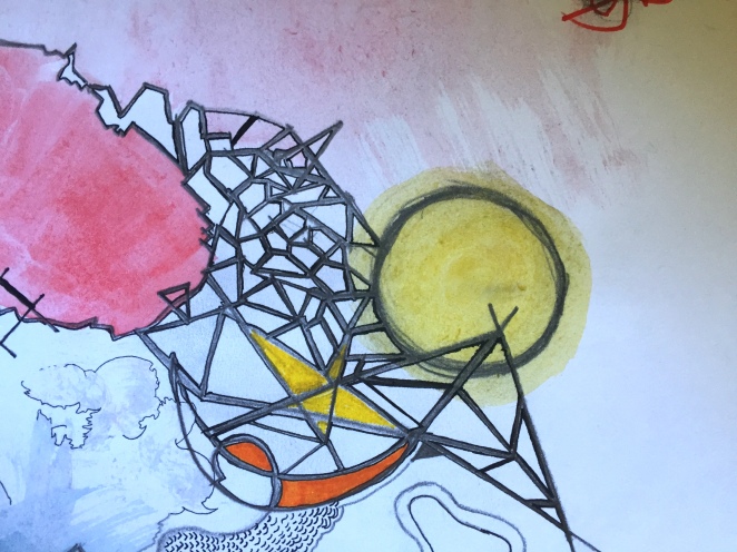
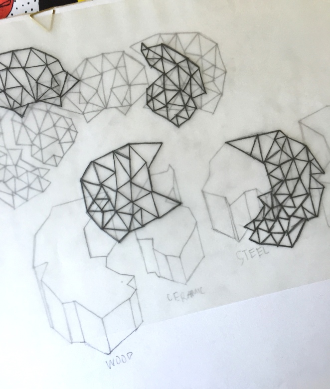
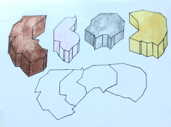
Charles Avery’s work was a starting point for this project as the brief made me think about and unexplained world. Since 2004, Avery has dedicated his practice to an imaginary island he depicts through sculpture, paintings and text.  As time was limited I couldn’t establish a whole new world and so I decided to pick a particular area to focus on. Initially it was going to be a collection of objects I had created, a new language, or a series of drawings showing certain landscapes in my new land however I then began to think about diagrams to explain the scientific aspects of my world. I then decided I wouldn’t create my own world at all; I would explain a scientific observation that was yet to be explained on earth. After researching unexplained science, the moon illusion seemed to be the most appealing concept to explain.


What The Human Brain Will Believe

I thought it was particularly interesting when expressing this idea to friends that one of the responses was “Is that true?” With the use of long, scientific jargon and eerily familiar territory, it was pretty easy to lie to the human brain.

I became interested in what our brains will believe and watched the BBC documentary ‘The Brain: A Secret History.’ The first episode ‘Mind Control’ explores the sinister ways science has been used over the years to control human behaviour and change our deep rooted perceptions of the world to something completely new.

The Brainwashing of American Prisoners of War

During the Korean War, the Chinese managed to get some American soldiers to make anti-American statements which clearly distressed many Americans viewing the footage that had been created. This was achieved by placing prisoners in conditions not suitable for long term human survival and then offering them better sleeping conditions, better food and warmer clothes. By taking advantage of the already vulnerable they changed the brain in an extraordinary way and the west were baffled.

Electric Shock Treatment: The ‘Obedience’ Experiment by phycologist Stanley Milgram

An experimenter directed random volunteers to give an electric shock to a ‘learner’ behind a screen who was trying to learn tasks. Each time this learner failed they would receive an electric shock which increased in intensity- the highest being an apparently lethal shock. These random volunteers were blind to the fact that the experimenter and learner were in fact actors; the electric shocks were fake. However many of the volunteers gave this ‘lethal shock.’ According to Milgram, despite the apparently sinister implications, the participants’ willingness to obey authority was a necessary condition for the smooth functioning of society.

Robert Heath’s Electrodes Experiment

American psychiatrist Robert Heath is most infamous for his experiment on a 24 year old gay man whom he would “turn straight.” Electrodes were implanted into the patient’s head whilst straight porn was shown to him and then pleasure centres of the brain were activated via the electrodes. The patient began to associate heterosexual sex with pleasure.

While disturbing at times, these being very extreme cases, it was interesting to discover how it was possible to take control of the mind and particularly the theories behind the brainwashing of American PoW’s and the ‘Obedience’ experiment wouldn’t be out of place in today’s society.


My Installation

This slideshow requires JavaScript.

Disclaimer: Oranges and The Moon is untrue and will remain that way until proven otherwise. My installation explores this fake scientific theory complete with posters, diagrams, actual oranges displayed as if they’re some spectacle to behold, and fake business cards with no means of contacting me.

I wanted to depict how easily the brain can be lied to (look up Joan Fontcuberta: false negatives) and also explore the thirst for knowledge that humans are plagued with; the world must be explained; we must have an answer for everything.

If I had longer for this project I would explore other avenues that came to mind whilst completing my work. I liked the idea that consumerism would take over and there’d be a mass shortage of oranges whilst mandarin farmers were struck by poverty as nobody bought their products anymore. I’d have created fake documentaries with the same familiar feel of the installation and perhaps set up a museum like exhibition with more content about the amazing orange.

Textiles

When taking photographs I was mainly looking for aesthetically pleasing, but interesting, objects that could be directly translated into deigns. An exception to this was the picture I took of paper scattered on the ground. I thought this was interesting as I could transform the paper into something else to create my designs.

dsc_0834

I immediately knew I wanted to work in a stationary/ gift context as this is what I am interested in most opposed to fashion. I also thought the photos I had taken would translate better onto stationary than garments.

Initially I thought I would create food related designs based on the pictures I took in Greggs and made some initial ideas.

dsc_0854

img_2732


I then began to respond to the other pictures to see if any other ideas would emerge.

Another theme in my photos that I thought would translate well into a stationary/gift context was road signs/text and so I made an initial collage from the images I had taken. I also thought about creating an autumnal themed design and so I used the photos I had taken of leaves to create some autumn inspired elements that could feature in my patterns.

img_2733

The photo that I had taken of paper scattered on the pavement sparked the idea of origami and I drew some origami animals. I thought this was my strongest idea and decided to take it further. I experimented with mark making inspired from my trip around Newcastle that could potentially be layered underneath my designs. I particularly liked the ‘functional’ one as this worked well as a filler for the animals i had drawn.

img_2731


I used the mirroring technique to develop my designs further and this formed the base for two of my final design ideas.The first design was an autumn themed design inspired by the elements I had initially drawn. I filled the background in with the ‘gritty’ mark making I had created. I layered this design onto some parcel paper and really liked the outcome. Although I wasn’t going to use this particular design for my final patterns,  I decided I would use the parcel paper idea.


The second design idea was based on the food drawings I initially made. I decided to do a citrus themed pattern again using the mirroring technique and I filled the background with some shapes I had created earlier. The colour in the background was created by pressing my design onto some paint; this was just experimentation but I was pleased with the outcome.

Final Design

The idea I took to my final design was the origami animals, in particular the dinosaur motif. I decided I would create a single image for a card design and a matching wrapping paper. I experimented with the mirroring technique but then decided this wasn’t the outcome I desired. I also experimented with colour and decided green and orange would be a suitable colour palette. I developed some more designs and decided on the final design for the card:

img_2774


I then began developing the wrapping paper:


I am pleased with the final outcome of my designs however I would have liked to incorporate more layering into my designs, perhaps using my mark making, to create a more interesting outcome. As my digital skills are limited I found it difficult to achieve exactly what I wanted and the final designs could certainly be perfected more to achieve a cleaner look. Digital skills are definitely something I am looking to improve on throughout the duration of this course.

img_2779img_2773


Fashion

Brief: Take An Artist

Artist Given: Anish Kapoor

Anish Kapoor

Anish Kapoor is a British-Indian sculptor. Born in Bombay, Kapoor has lived and worked in London since the early 1970s when he moved to study art, first at the Hornsey College of Art and later at the Chelsea School of Art and Design.

When deciding how I could translate his work into fashion designs as well as focusing on his sculptures I looked at the drawings behind his works. This lead me to make some interesting mark making which features heavily in my final designs.

When responding to the artist I created my own patterns inspired by his works and also focused on shapes within his sculptures to make 2D patterns that could be put onto my final garments.

I quickly decided my collection would be a Spring/Summer collection and I began to experiment with the patterns I had created by collaging them onto garments to begin developing them into final designs. I was happy with the outcome of these developments and decided I just needed to finalise the designs to create my final collection. I also decided my model should be ‘geometric’ looking much like Anish Kapoor’s sculptures.

Garment 1

The first garment I designed is a t-shirt influenced by my initial mark making which covers the entire shirt. The design on the final garment collection is a slightly different shape to the one I drew in the development stages as I wanted a slightly more geometric, interesting look rather than just a plain t-shirt shape. I feel the garment on my final designs would be used for catwalk purposes and the development stages of the garment could be used for commercial use as it would be easier to recreate and mass produce. This is my favourite garment I have created; I think it is clear to see the steps I have taken from initial research to the final design with influences from Anish Kapoor.

Garment 2

This garment is a dress, again using the mark making I created at the beginning of the project. However, this time the mark making is inspired by the designers I looked at, in particular Minki. This design sets the colour scheme for all the garments. The shape of the dress was inspired by the trend forecasts on the WGSN website. I chose to design a drop waist dress with my pattern on the sides. I wasn’t particularly happy with this garment and felt it was the weakest out of all of my designs and stood out as if it wasn’t part of the collection. To improve this design I would choose a different garment shape, perhaps a more geometric one, and incorporate aspects of Anish Kapoor’s work as well as the designers.

Garment 3

My 3rd garment is an oversized jacket inspired by the designer too good. I used an oversized, geometric shape with one of my patterns printed onto the middle. The collar was inspired by a shirt I looked at on the WGSN website. I particularly like the different shaped buttons on this garment and think it fits well with the overall collection. If I were to do this project again I would look at this garment in particular when contemplating materials so it is clear the garment is for a spring/summer collection.

Garment 4

This design is a strappy came top strongly influenced by Anish Kapoor’s sculptures. When responding to his sculptures, I decided the shape I had created could be directly translated into a garment and is one of the designs I haven’t changed from the development stages. However, I do think the garment shape could be taken more into consideration perhaps looking more into future trends or the garment shapes of the designers I researched.

Garment 5

Another design I didn’t modify from my developments was a pair of wide leg trousers. A trend that is very much dominating commercial fashion at the moment is the A line shape and so I used this in my design and I really like how my initial mark making translated into this design.

Garment 6

The last garment in my collection is again inspired by a highstreet trend of frayed jeans. To incorporate my artists /designers into the garment I used my colour palette on the frayed ends. The jeans a re dark blue with a straight leg fit.

Processed with VSCO with a6 preset

Processed with VSCO with a6 preset

3D

After doing group research into Whitley Bay my initial thoughts were that it was pretty run down and neglected. After deciding I wanted to design a conceptual piece I did some artist research.

B. Wurtz.

“B. Wurtz is best known for his carefully assembled sculptures and installations made of a wide range of commonplace, discarded materials. A prideful appreciator of lowly objects, his practice is highly concerned with the ethics of re-use and highlighting the overlooked.”

-http://www.balticmill.com/whats-on/b-wurtz

This lead me to the idea of creating a design that would highlight the neglected and overlooked. This would hopefully show how today we don’t often think about the little things and are too busy with our lives to notice what really matters. To show this I would use found objects as the main focus of my design. Initially I was going to create a sculpture of these objects however after researching Martin Creed I decided I wanted to portray my idea through words.156

The found objects I used in my design were:

  • A train ticket
  • A rock
  • A receipt for milk
  • Part of a crushed traffic cone

With these objects I created a text that I would use in my art:

“I travelled from London to Durham. Semi skimmed milk was 75p. I found a rock and painted it gold. Approximately 1/8th of a traffic cone was smushed to the ground.”

To present the words I decided I would use part of a building highlighting the unfinished and wasted potential that is too often seen in our busy lives. The outside would be made from bricks and the inside would be white with my text painted on the inside. Here is my final design:

img_2495

I the  started thinking about how I would create a model for my design and decided clay would be the most effective material to express my idea.

Experimenting with clay.


I created individual bricks and built my walls.

In summer 2016 I visited Iceland and found this art installation by Olof Nordal.

dsc_0370

It is called Thufa which translates to ‘mound’ or ‘tussock.’ It was commissioned by the fishing processing company HB Grandi and as well as being a piece of art is used to dry fish in the little hut at the top. This inspired me to think about how I could also make my design functional.

I decided I would also design some seating that would be placed inside my installation for people to sit on. My final idea came from my initial mark making that I made at the beginning of my project.

img_2492

img_2491

I made 4 shapes out of triangles that fit together to make one bench or could be taken apart to make individual seating. Each seat would be made from a different material: wood, ceramic, steel and plastic. Here is my final design:

img_2490

Lens Based Media

The brief for Lens Based Media was ‘Obsessions.’ After making a group mind map, I decided to focus on the theme of power which then lead me to the idea of basing my work around the novel ‘American Psycho’ by Bret Easton Ellis. I then began artist research to explore the different directions I could take my ideas.

The first artist I researched was Daniel Kukla. I particularly liked his series inspired by animals in captivity focussing on the human obsession to be connected to the natural world. I also thought his works could link to obsession with escape, exploration and discovery.

Next I looked at Francessca Woodman. I liked the mysteriousness of her photos and, particularly from the photos below, I thought her photographs explored loneliness, abandonment and lack of identity which I decided i wanted to explore in my photographs. I think the black and white is very effective in her photos however decided my ideas would be best explored through the use of colour images.

francesca-woodman-house-3-providence-rhode-island-1976

Space?, Providence, Rhode Island, 1975-1978 1975-8 by Francesca Woodman 1958-1981

Space?, Providence, Rhode Island, 1975-1978 1975-8 Francesca Woodman 1958-1981 ARTIST ROOMS Acquired jointly with the National Galleries of Scotland through The d’Offay Donation with assistance from the National Heritage Memorial Fund and the Art Fund 2008 http://www.tate.org.uk/art/work/AR00350


I decided my work would be best be explored through fine art photography and began to research artists who would inspire the ‘set’ I would create for my photographs.

I found Josef Mrva and Aya Haidar and then began my initial plans with help from my visual research of Bret Easton Ellis’ novel and the film adaptation.
thumb_img_2332_1024

thumb_img_2333_1024


thumb_img_2334_1024


thumb_img_2336_1024

thumb_img_2335_1024

I knew I wanted to focus on American Psycho but i didn’t know how i wanted to present my work so I explored different ways of how my final outcome would look. I decided to choose between a single image, a series of images, or a collage like outcome inspired by David Hockney’s images. I decided to do a series of images however if the outcome was not what i desired I decided I would try a short film to portray my idea.

American Psycho

American Psycho is a novel by Bret Easton Ellis in which the protagonist Patrick Bateman is portrayed as a wealthy businessman who has it all. He is consumed by the idea of perfection, possessions and the ‘american dream.’ He is also a serial killer. The chapters switch between his mundane everyday activities and his psychotic episodes which are just a normal part of his life. I wanted to portray this in my photos and so used the shocking backdrop of some sort of dead animal and blood contrasted with ‘Patrick Bateman’ sitting in his garden eating breakfast.

I was also inspired by the quote “…there is an idea of Patrick Bateman, some kind of abstraction, but there is no real me, only an entity, something illusory, and though I can hide my cold gaze and you can shake my hand and fell flesh gripping your and maybe you can even sense our lifestyles are probably comparable: I simply am not there.” I decided to sew this quote onto a shirt (inspired by Aya Haidar) as this is symbolic of a hardworking business man: the personality everybody sees but isn’t truly who Patrick Bateman is. I wanted to explore the idea of identity ; nobody knows the true Patrick Bateman and so used a mask to cover his face and ‘hide’ who he really is.  I wanted my photo to show his two personalities (the personality he knows and the personality others see) colliding. Perhaps showing he doesn’t really know who he is himself.

screen-shot-2016-09-18-at-13-40-49After shooting the photos I needed to decide which ones would make up my series of images which i decided should be kept to a maximum of 4/5 images. I wanted my idea to be  understood but concise.

These are my final images:

imgp4530

imgp4502

imgp4471

imgp4524

imgp4526

If I was to improve my project I think I would enhance the final outcome by exploring different ways of presenting my work. I would’ve liked to experiment with film photography; perhaps using techniques such as double exposures for a more interesting final piece. However I wasn’t sure if my message would’ve been portrayed as clearly and effectively if I had used this approach. I would’ve also liked to explore the collage approach maybe not with the whole frame but with details such as the trees.

I am pleased with the final outcome but I would plan the shots I want to take to a more in depth standard if did this project again. Although the end product is what I desired, I spent a lot of time thinking about what I wanted the photos to look like after I had set up the frame which meant my time wasn’t spent as effectively as it could’ve been and I couldn’t focus on exploring different ways of presenting my idea.